 If you’ve worked on projects for very long, you’ve no doubt heard somebody (usually a manager or executive who just read an article) say, “We have to identify our risks! We must know what is coming and how to avoid it!”
And the exercise involves an all-hands session where people throw out ideas, somebody documents it, and the results get filed away with other artifacts that never see the light of day again. A bit of a doomsday outlook you say? I would agree had I not seen some variation of this play out over and over again.
REALITY OF PROJECT RISKS
Project risks are a reality, but they are a reality that is most often misunderstood and rarely analyzed early enough in the project cycle. My advice (and the point of this article) is to start those brainstorming sessions up front and then, rather than just file the results away, begin to analyze and then track risks and indicators. Even before you have a resolution or strategy to handle a risk, I suggest you grade it for two factors: 1) likelihood it will actually happen and 2) impact to the project and/or organization if it does happen. And keep in mind this thought I ran across in my travels:
A risk is something you can smell. If you already stepped in it, it’s now an issue.
HEAT MAP SCALES
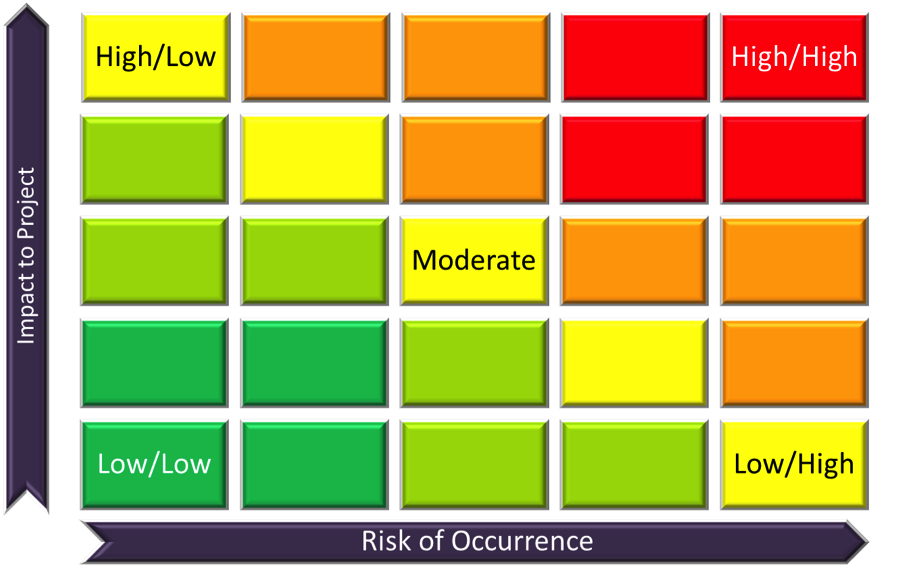
I like to grade risks on a 5-by-5 scale with the x and y axis representing the likelihood and severity of impact. The result would look something like this:
While some advocate a 3-by-3 matrix, I find the 5-point scale allows management enough granularity to categorize the medium risks while segregating both the very high and those that fall in between. Grading in this fashion allows you to identify those risks that most need a plan for mitigation, avoidance, or other strategy while leaving lower impact items for later. Assigning each block a factored number (where the highest is 5 x 5 or 25 and the lowest is 1 x 1 or 1) provides a tangible scale you can use to explain risks to stakeholders and gain their agreement regarding the approach to handling each.
While far from perfect, this simple mechanism allows reality to be seen graphically by all project team members and can open the dialogue on the full spectrum of risk and issue management. You may even want to consider a dashboard or other physical representation (such as in the main project room) where risks are plotted on the graph and their weight can be changed based on new information you gather. Keeping the graph in the “public eye” avoids the dusty confines of the project archives and creates more awareness when a risk happens and becomes an issue.
After all, communication is key to any project success, and you want to know when that “scent of risk” becomes so strong that you are about to “step in” the issue.
Bio:
Mark Moore, M.Ed., PMP is a project and program management consultant from the Raleigh, North Carolina area. His company, Broken Arrow Associates, Ltd. provides project management, consulting, and training services to a wide variety of organizations.
https://insights.cermacademy.com/2013/10/29-the-great-pretenders-mark-moore/
